Conversion focused web design is the key to turning visitors into paying customers. Imagine you’ve poured thousands into ads, SEO, and social media—yet people visit your site and leave without taking action. Frustrating, right?
The problem isn’t traffic. It’s conversion. You don’t need more clicks—you need a design that converts.
This is where a conversion-focused strategy makes all the difference. It’s not about flashy visuals or trendy features. It’s about using smart design choices to guide visitors toward a goal—whether it’s buying, signing up, booking, or downloading.
In this guide, you’ll learn what conversion focused web design really means. You’ll see how it boosts revenue. You’ll also discover strategies that actually work. This means you can apply them with confidence. Finally, you’ll learn how to build high converting landing pages. This works because every element helps close the deal.
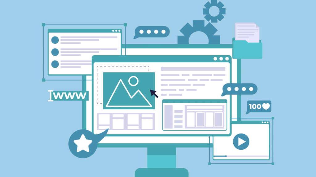
What Is Conversion Focused Web Design?
Conversion focused web design is the art and science of designing websites with a clear goal: maximize user actions that drive business growth. Traditional websites often prioritize aesthetics or brand messaging. However, conversion-focused design is different. It prioritizes user experience, intent, and persuasive design. This matters because these elements drive action.
Every element—from layout and copy to buttons and images—is built to encourage specific actions.
It’s closely tied to conversion rate optimization (CRO)—the ongoing process of testing and improving those design elements to increase the percentage of visitors who convert.
Landing pages are a key battleground here. A well-crafted, high converting landing page design can mean the difference between a bounce and a buyer.
The Business Case: Why Conversions Matter
Let’s talk numbers. Improving your conversion rate by just 1% can make a big difference. It can boost your revenue by 20–30%.And you don’t need to spend another dollar on marketing. Small design changes can lead to big results.
Why? Because customer acquisition is expensive. You already paid to bring that visitor to your site. Failing to convert them is leaving money on the table.
Consider this:
- Your site gets 10,000 visits per month. And it converts at 2%. So, that means 200 leads.
- Increase to 3%? That’s 300 leads. You didn’t pay for more traffic—you just made your site better at closing.
Conversion focused design aligns your website with ROI-driven goals. It’s no longer a digital brochure—it’s a revenue-generating asset.
Core Principles of Conversion Focused Web Design
1. Clarity & Simplicity
Visitors should instantly understand what your site offers. Clutter confuses. Simplicity converts. Stick to one primary goal per page and communicate it clearly.
2. Visual Hierarchy & F-Pattern Layouts
People scan web pages in predictable patterns. Design with this in mind. Place your most important content and CTAs where eyes naturally land. That’s usually the top left, center, and above the fold.
3. Trust Signals & Social Proof
Badges, reviews, case studies, and client logos build credibility. People want to know others trust you before they do. So, testimonials and stats matter. For example, “5000+ happy customers” shows trust and builds confidence.
4. Responsive & Mobile-First Design
Over 60% of traffic is mobile. If your site isn’t optimized for small screens, you’re turning away half your audience. Test responsiveness, speed, and mobile navigation religiously.
Conversion Rate Optimization Strategies That Work
Conversion focused design isn’t a set-it-and-forget-it project. It’s an evolving practice fueled by data, testing, and psychology. Here are some proven conversion rate optimization techniques:
1. A/B Testing Headlines and CTAs
Your headline is your hook. A/B test different versions to see which grabs attention and converts better. Do the same with CTA (Call to Action) buttons—text, color, placement, size.
2. Personalization & Dynamic Content
Tailor messages based on user behavior or location. “Welcome back, Sarah!” or showing region-specific offers increases relevance and conversions.
3. Form Minimization & Progressive Profiling
Long forms kill conversions. Start with essentials (name, email) and gather more info later. Use multi-step forms to reduce friction.
4. Page Speed & Performance Tweaks
Every second of delay cuts conversions. Compress images, eliminate unused scripts, and use fast hosting. Google recommends a load time under 3 seconds.
5. Psychological Triggers
Use urgency (“Limited spots left!”), scarcity (“Only 3 seats available”), and reciprocity (“Free checklist download”) to motivate users.
High Converting Landing Page Design Best Practices
Your landing page is the finish line. So, whether it’s for a product, event, or lead magnet, the goal is simple. Because you want the user to take action and convert. And that action drives your success. Here’s how to design a high converting landing page:
1. Compelling, Benefit-Led Headline
Speak to the user’s problem or desire. Instead of “Our Software,” say “Save 10+ Hours a Week With Smarter Automation.”
2. Single, Clear Call-to-Action
One page. One purpose. One CTA. Don’t confuse users with too many options.
3. Minimal Distractions
Remove headers, menus, footers—anything that lets users click away. Keep them focused.
4. Visual Storytelling
Use images and videos to show value, not just tell. Demo videos, before/after images, or product shots in action perform well.
5. Trust Badges & Testimonials
Add logos of clients, 5-star reviews, or quotes from happy users to reduce risk for new visitors.
Tools & Metrics for Tracking Conversions
What gets measured gets improved. Use these tools to monitor performance:
Tools:
- Google Analytics (Goals & Funnels)
- Hotjar (Heatmaps & Session Recordings)
- Optimizely / VWO (A/B Testing)
Key Metrics:
- Conversion Rate: % of visitors who complete a goal
- Bounce Rate: % of visitors who leave without engaging
- Time on Page: Longer time usually = more interest
- Funnel Drop-Off: Where users abandon before converting
Set benchmarks monthly. Track and tweak continuously.
Common Mistakes to Avoid
Avoid these common pitfalls that kill conversions:
- Too Many CTAs: One page = one goal
- Ignoring Mobile Users: Always test mobile first
- Poor Readability: Small fonts, weak contrast
- No User Testing: Design based on data, not guesses
- Forgetting SEO: A beautiful page that doesn’t rank is useless
Conclusion: Stop Guessing, Start Converting
Conversion focused web design isn’t a trend—it’s a competitive advantage. It’s the secret to getting more from the traffic you already have.
Now is the time to audit your site, test a new landing page, or optimize a key CTA. Every tweak could mean real growth in leads and revenue.
Need expert help?
Partner with ENEXXUS to transform your site into a conversion powerhouse.
Book your free consultation today and start turning visitors into customers.
FAQs About Conversion Focused Web Design
Q1: What makes a website “conversion focused”?
A conversion-focused website has one main goal. It’s to get visitors to take action—whether buying, signing up, or booking. And that drives your business growth. Every design and content element supports that objective.
Q2: How is conversion focused design different from traditional design?
Traditional design focuses on branding and looks. But conversion design focuses on user behavior and psychology. And it uses performance metrics to drive real results.
Q3: Do I need to redesign my entire website for better conversions?
Not always. Sometimes, tweaking high-traffic pages helps. And optimizing your landing pages matters too. Because these changes can improve conversion rates significantly. So, you don’t always need a full redesign.
Q4: What’s a good conversion rate?
A good conversion rate varies by industry, but for most websites, a rate between 2–5% is considered average. With optimization, many businesses aim for 10% or higher.
Q5: How often should I run A/B tests?
Continuously. Testing should be part of your monthly routine. Even small changes in headlines, images, or CTA buttons can have big impacts over time.
Q6: How do I know if my landing page is high converting?
Measure your conversion rate, bounce rate, and engagement time. A high converting landing page typically has a clear CTA, fast load times, strong visuals, and trust-building elements like reviews or guarantees.
Q7: Can ENEXXUS help improve my site’s conversion performance?
Absolutely! We specialize in conversion focused web design, landing page creation, and CRO strategy. Reach out for a free consultation to see how we can help.